Amusements for Insomniacs

I happened to be awake just before 2AM this morning, so I put on my Apple Watch and watched to see what happened when 2AM rolled around and Daylight Saving Time ended. At exactly 2, as the second hand passed 12 on the watch face, nothing. Then, at 4 seconds past 2, the hour hand jumped back one hour.

How exciting!

(As for why California did the Daylight Saving Time Tango this year, blame politics.)

A Glimpse of Rivendell on My Wrist

I recently replaced my original model Apple Watch (sometimes referred to as a “Series 0” model) with a Series 4. I really liked my old watch, but Apple stopped issuing system updates for that model so I knew its days on my wrist were numbered. When I finished a couple of particularly big projects recently, I decided that my reward would be a new Apple Watch.

The new Series 4 is a worthy replacement. Everything (except, of course, the time) runs much faster on it. It has a much better speaker. It does ECGs. It has great battery life. It can spit water!

But my favorite feature is its slightly larger display, and its ability to run the Kaleidoscope watch face full-screen on it.

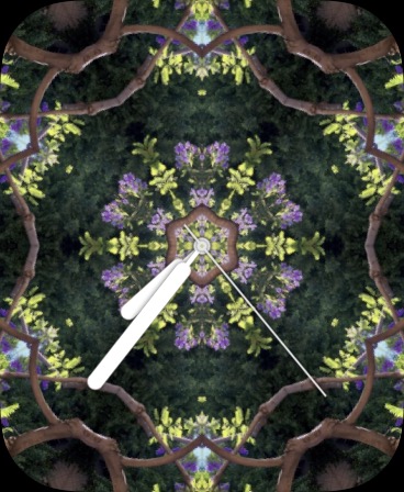
On my old watch I had created a Kaleidoscope watch face based on a photo I had taken of some jacaranda tree blossoms. The result was a watch face I nicknamed “Rivendell.”

Rivendell looked lovely on my old watch, and it continues to look lovely on my new one. But when I made a full-screen version of it for my new Apple Watch, it became mesmerizing. In fact, it’s so mesmerizing that I consume much of my new Apple Watch’s extra battery power by keeping my portal into Rivendell running on my wrist for minutes at a time while I gaze at it. It’s very calming—much more so than the Breathe app.

Rivendell Face Full-Screen
A still image cannot convey the stately Elvish grace of this slowly animating watch face.

Now, I don’t know for a fact that jacarandas grew in Rivendell, but Elrond, who ran the place, knew Gandalf, and he knew the Valar queen Yavanna Kementári (the Giver of Fruits)  back in the old country, and she is the one who basically planted all the original foliage on Middle-Earth, so if Elrond had wanted one of those purple-blossomed lovelies in his valley estate, he could probably pull a few strings.…

“I Do Not Know”

Lauren Goode, at writer at The Verge, says that Apple’s forthcoming watchOS 3 is “an admission that Apple had it all wrong when it came to interactions on the first-generation Apple Watch.” It is no such thing, although the headline makes for great clickbait!

With the first release of the Apple Watch’s OS, Apple got some things wrong and some things right, just as most developers do when they release a brand new product. Designing a user experience is an inexact science. Sure, there are protocols and methodologies for doing it that have a deep grounding in psychological and behavioral research, but all employing them does is get your product closer to delivering a good user experience the first time out of the box.

It’s only when a product has been in use for a while in a large and diverse user population can the developers see more of the pain points their initial design had, and then devise ways to mitigate them. Apple addressed some of them in watchOS 2, and has addressed more of them in watchOS 3.

Goode says that watchOS 3 “requires fewer swipes and taps and less wait time just to get an app going. Why wasn’t it like this before? I do not know.”

I do know. Anyone with actual consumer software development experience does.

Why doesn’t Goode know this? I do not know.

I’m loopy!

I found a $16 knock-off of the space black Milanese loop band for Apple Watch on [Amazon][1], and, having a little gift certificate money left, ordered it. I like it so far. It’s obvious to the wearer that it ain’t an Apple band (the bare face of the magnet on the clasp’s underside, for example), but, once on the wrist, it looks and feels good. The [Apple band][2], btw, costs $199.

knockoff band clasp, detail

[1]: http://www.amazon.com/Marge-Plus-Magnetic-Stainless-Replacement/dp/B01ABRN0DA
[2]: http://www.apple.com/shop/product/MLJH2AM/A/42mm-space-black-milanese-loop

Some Apple Watch perspective

It’s been interesting to watch the coverage and analysis concerning Apple Watch. It does do this, it doesn’t do that, it’s pokey, it doesn’t work with sleeve tattoos, and, of course, it’s really expensive considering that it has no killer app!

Nonetheless, I think it is a remarkable, in fact, a stunning achievement.

Think of it: here’s a device that has multiple gigabytes of storage, both Bluetooth and Wi-Fi radios, a fast CPU, a bunch of sophisticated sensors, a microphone, a high resolution full color video display, a sophisticated touch sensitive interface, a rechargeable battery capable of running it for a full day — and all of this in a package that’s no bigger than a typical wristwatch. A package that, in the case of my series 7000 space gray aluminum Apple Watch Sport, weighs just barely over an ounce — heck, the lightweight fluoroelastomer band weighs 25% per more than the case and the whole thing on my wrist weighs less than 2½ ounces. And it’s less than 1½ inches wide, and only 1⅔ inches tall.

This is science fiction technology.

Apple Watch Sport

An accumulation of small pleasures

Now that I’ve been wearing my new Apple Watch for more a week, I’m beginning to get a better idea of its virtues, its limits, and how it fits into my life. I’ve already discovered that I don’t need the Apple Watch, but that I’m very happy to have one.

I don’t need one because the device offers no special features or functionality that I didn’t already have available to me in other ways. My old Timex told me the time and offered a stopwatch when I needed one, and for the rest there was my iPhone, which (aside from also doing clock and stopwatch duty) already handled phone calls, messages, email alerts, Apple Pay, Apple TV and iTunes remote control, weather reports, Major League Baseball score updates, and even rudimentary fitness tracking.

What the Apple Watch does is to act as digital WD-40: so many little things become so much more frictionless with it.

  • I don’t get many phone calls, but when I do, they often occur at the most inconvenient times, times when my phone is nearby but not ready to hand, such as when I’m preparing a meal or visiting the smallest room in my apartment.. With my Apple Watch, I can answer the call or send it to voicemail and not have to wonder who rang me.
  • Same with messages and email alerts: with my iPhone and iPad and Mac all chiming at once when a digital communique comes in, it’s really tempting to drop everything and get to the nearest device to find out what just arrived. Now the nearest device is strapped to my wrist, and I only have to lift it to see what’s what.
  • I don’t use Apple Pay much, but when I do, paying with the Apple Watch is less stressful and troublesome than with my iPhone: I always feel a small worrisome fear that I could drop my phone while fumbling it from my pocket to the NFC reader, but I know my Apple Watch can’t fall to the floor and smash while I’m trying to buy a chipotle chicken panini at my local Panera.
  • I have an iPad, an iPhone, and an Apple TV Remote that all can control my Apple TV or iTunes player, and they all can do more than the Apple Watch Remote app. But I usually don’t need that extra functionality: I mostly need to pause what’s playing (or play what’s paused) or adjust the volume, and the Apple Watch app does those things just dandy. It also lets me know what I’m listening to for those times when I’m working at my Mac and iTunes is buried two Mission Control desktops away while it shuffle plays my whole music library: I just raise my wrist to see.
  • The iPhone Weather app is great, and it gives me a sad 😢 when I’m using my iPad and want to check what conditions are like out in the Big Blue Room. Now I have weather reports always at hand…literally.
  • I love MLB Baseball’s Game Day app and the wealth of information it provides. But when I just want to check the score of the current Dodger game (or find out when it starts), all I need do is take a quick Apple Watch glance.
  • As for fitness…. I am by nature a sedentary person, almost sessile, really, but lately I’ve been trying to go for more walks (I do live in a very walkable neighborhood, just a mile away from the bluffs overlooking Santa Monica Bay). The iPhone Health app has been great for keeping track of how much walking I’ve done on a given day. But the Apple Watch Activity app does an even better job of keeping me up to date on my peregrinations, and its gimmicky achievement rings really do provide me with just a little extra incentive to abandon my desk or sofa more often. Nor do I need to open an app to see it: the activity summary is a complication right on the watch face. Ironically, I put more effort into improving my fitness the less effort it takes me to track it.

The Apple Watch does not provide a single killer feature. Rather, the accumulation of small conveniences and pleasures that it provides is its actual killer feature, and one that you can’t demo.

It only emerges when you live with the watch day after day.

Album covers as seen through a shower door

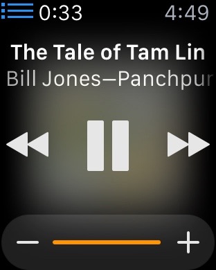
When you play music from your iTunes library, the Remote app on the Apple Watch shows the album cover behind the controls. However, a translucency effect renders the cover an unrecognizable blur.

Not much detail in this album cover.

I applaud Apple’s attempt to give the user some additional visual feedback in the Remote app, but the execution…? Meh.

“It‘s a goddamn piece of hardware”

“This isn’t a vision quest or zen retreat. It’s a goddamn piece of hardware.”

So said a friend of mine as he expressed his frustration with using his new Apple Watch. And he was right. It is just a piece of hardware.

The problem is there are lots of different kinds of hardware, with all sorts of differing capabilities and ways to use them. You need to know what kind of hardware an Apple Watch is before you can use it comfortably…or, for that matter, decide if you care to use it at all.

More than anything else, an Apple Watch is an iPhone peripheral, designed to give you quick access to some (not all, just some) of the information, and some of the capabilities, that your iPhone provides. An Apple Watch does this by acting like a wristwatch.

And that leads us to its interaction model.

The wristwatch interaction model has never been about interacting deeply. It has been about giving you bits of information, quickly, while you’re doing something else. With a traditional watch, you look at it, see what time it is, then get right back to what you were doing. If you get sucked into fiddling with it, trying to get things done with it, you are doing it wrong. The only times you do much more with a watch than check the time (or maybe, for owners of advanced wristwatches, start and stop a timer) is when you are winding it or setting it.

That’s the basic interaction model on which the Apple Watch builds. You may spend some time from time to time setting it and winding it (that is, configuring its various options and charging it), but, beyond that, for the most part you just use it to quickly check the time (or weather, or current stock prices, or your schedule, or your location, or your pulse, and so on) while you’re doing something else.

Yes, an Apple Watch does have communication capabilities (texting, phoning) that require more lengthy interactions, but the Apple Watch’s form factor and interaction model really only permit the use of these capabilities, they don’t encourage their use. To use these more interactive capabilities comfortably, it’s best if you use them for short interactions only — not for deep heart-to-heart conversations with your beloved or for dictating your last will and testament. Think quick call, a short missive. Hit and run interactions.

If you attempt anything more complex than that with an Apple Watch, you will end up frustrated. And you needn’t because, remember? — an Apple Watch is a peripheral for your iPhone. Pull that device out of your pocket and use it.