An accumulation of small pleasures

Now that I’ve been wearing my new Apple Watch for more a week, I’m beginning to get a better idea of its virtues, its limits, and how it fits into my life. I’ve already discovered that I don’t need the Apple Watch, but that I’m very happy to have one.

I don’t need one because the device offers no special features or functionality that I didn’t already have available to me in other ways. My old Timex told me the time and offered a stopwatch when I needed one, and for the rest there was my iPhone, which (aside from also doing clock and stopwatch duty) already handled phone calls, messages, email alerts, Apple Pay, Apple TV and iTunes remote control, weather reports, Major League Baseball score updates, and even rudimentary fitness tracking.

What the Apple Watch does is to act as digital WD-40: so many little things become so much more frictionless with it.

  • I don’t get many phone calls, but when I do, they often occur at the most inconvenient times, times when my phone is nearby but not ready to hand, such as when I’m preparing a meal or visiting the smallest room in my apartment.. With my Apple Watch, I can answer the call or send it to voicemail and not have to wonder who rang me.
  • Same with messages and email alerts: with my iPhone and iPad and Mac all chiming at once when a digital communique comes in, it’s really tempting to drop everything and get to the nearest device to find out what just arrived. Now the nearest device is strapped to my wrist, and I only have to lift it to see what’s what.
  • I don’t use Apple Pay much, but when I do, paying with the Apple Watch is less stressful and troublesome than with my iPhone: I always feel a small worrisome fear that I could drop my phone while fumbling it from my pocket to the NFC reader, but I know my Apple Watch can’t fall to the floor and smash while I’m trying to buy a chipotle chicken panini at my local Panera.
  • I have an iPad, an iPhone, and an Apple TV Remote that all can control my Apple TV or iTunes player, and they all can do more than the Apple Watch Remote app. But I usually don’t need that extra functionality: I mostly need to pause what’s playing (or play what’s paused) or adjust the volume, and the Apple Watch app does those things just dandy. It also lets me know what I’m listening to for those times when I’m working at my Mac and iTunes is buried two Mission Control desktops away while it shuffle plays my whole music library: I just raise my wrist to see.
  • The iPhone Weather app is great, and it gives me a sad 😢 when I’m using my iPad and want to check what conditions are like out in the Big Blue Room. Now I have weather reports always at hand…literally.
  • I love MLB Baseball’s Game Day app and the wealth of information it provides. But when I just want to check the score of the current Dodger game (or find out when it starts), all I need do is take a quick Apple Watch glance.
  • As for fitness…. I am by nature a sedentary person, almost sessile, really, but lately I’ve been trying to go for more walks (I do live in a very walkable neighborhood, just a mile away from the bluffs overlooking Santa Monica Bay). The iPhone Health app has been great for keeping track of how much walking I’ve done on a given day. But the Apple Watch Activity app does an even better job of keeping me up to date on my peregrinations, and its gimmicky achievement rings really do provide me with just a little extra incentive to abandon my desk or sofa more often. Nor do I need to open an app to see it: the activity summary is a complication right on the watch face. Ironically, I put more effort into improving my fitness the less effort it takes me to track it.

The Apple Watch does not provide a single killer feature. Rather, the accumulation of small conveniences and pleasures that it provides is its actual killer feature, and one that you can’t demo.

It only emerges when you live with the watch day after day.
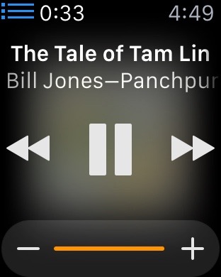
Album covers as seen through a shower door

When you play music from your iTunes library, the Remote app on the Apple Watch shows the album cover behind the controls. However, a translucency effect renders the cover an unrecognizable blur.

Not much detail in this album cover.

I applaud Apple’s attempt to give the user some additional visual feedback in the Remote app, but the execution…? Meh.

“It‘s a goddamn piece of hardware”

“This isn’t a vision quest or zen retreat. It’s a goddamn piece of hardware.”

So said a friend of mine as he expressed his frustration with using his new Apple Watch. And he was right. It is just a piece of hardware.

The problem is there are lots of different kinds of hardware, with all sorts of differing capabilities and ways to use them. You need to know what kind of hardware an Apple Watch is before you can use it comfortably…or, for that matter, decide if you care to use it at all.

More than anything else, an Apple Watch is an iPhone peripheral, designed to give you quick access to some (not all, just some) of the information, and some of the capabilities, that your iPhone provides. An Apple Watch does this by acting like a wristwatch.

And that leads us to its interaction model.

The wristwatch interaction model has never been about interacting deeply. It has been about giving you bits of information, quickly, while you’re doing something else. With a traditional watch, you look at it, see what time it is, then get right back to what you were doing. If you get sucked into fiddling with it, trying to get things done with it, you are doing it wrong. The only times you do much more with a watch than check the time (or maybe, for owners of advanced wristwatches, start and stop a timer) is when you are winding it or setting it.

That’s the basic interaction model on which the Apple Watch builds. You may spend some time from time to time setting it and winding it (that is, configuring its various options and charging it), but, beyond that, for the most part you just use it to quickly check the time (or weather, or current stock prices, or your schedule, or your location, or your pulse, and so on) while you’re doing something else.

Yes, an Apple Watch does have communication capabilities (texting, phoning) that require more lengthy interactions, but the Apple Watch’s form factor and interaction model really only permit the use of these capabilities, they don’t encourage their use. To use these more interactive capabilities comfortably, it’s best if you use them for short interactions only — not for deep heart-to-heart conversations with your beloved or for dictating your last will and testament. Think quick call, a short missive. Hit and run interactions.

If you attempt anything more complex than that with an Apple Watch, you will end up frustrated. And you needn’t because, remember? — an Apple Watch is a peripheral for your iPhone. Pull that device out of your pocket and use it.

A Matter of Time

When I placed my pre-order for the Apple Watch, this is what I first saw:

Initial pre-order status

It continued to show the delivery date range of 4/24-5/8, even after the initial date of 4/24 had passed. That was somewhat distressing because it implied that the system wasn’t even bothering to track the order status but just displaying a canned status report.

After my credit card was charged, on 4/27, the status changed to this:

Preparing for delivery

This was no longer distressing, but it was annoying, because the earliest possible date in the date range had already passed, so it just seemed like a bit of programmatic incompetence.

The correct thing for the order system to do once the initial date in the delivery range has passed is simply not to include the first date in the range. Rather, it should say, in the case of the second status form shown above, that delivery will take place “by 5/8”. Including the original date in the range is useless information.

Update: Of course, this makes it all better.

It has shipped.

Mainspring and Fall

A unplanned collaboration via email:

MICHAEL, are you grieving
Over Apple Watch not shipping?
This bright thing of man you
With your old heart care for, can you?
Ah, as the year grows older
That lack will make you smolder
By and by. And pout. And sigh
As, watchless, weeks and months go by,
And so you will weep and know why.
Now no matter, Cohen, the name:
False watch springs are the same.
Nor face had, no nor hands, expressed
What Mickey heard, Minnie guessed:
It is the pause man was born for,
It is Apple Watch you mourn for.

EBK-MEC

Apple Watch—First Impressions

My Apple Watch, a 42mm Space Gray Sport, is still in the Apple Store’s “processing” phase and hasn’t yet been shipped, but because everyone else is already posting their first impressions, I would be disappointing my massive fanbase if I didn’t post mine.

So far, it’s a mixed bag:

  • It’s much lighter than I expected: I can’t even feel it on my wrist.
  • Battery life seems excellent. It hasn’t needed a new charge yet.
  • App loading appears to be broken.
  • The Taptic Engine is beyond feather-light. I haven’t noticed a single tap.
  • The learning curve is swift.
  • So far, no alerts to stand up, perhaps because I work at a standing desk. Will investigate further.
  • Siri doesn’t listen.

As I become more familiar with how it fits into my daily life, I’ll be back to post more.

What happened in Super Bowl XLIX

A recap for those who missed it.

Balls were thrown. Some were caught. Some weren’t. Some balls that were caught were caught by the opposing team. Fans cheered. Fans booed. There was a fight.

The most important thing we learned was that putting babies and puppies in commercials has something to do with selling automobiles and beer.

Oh, yes, we also learned that Katy Perry likes to ride mechanical devices while singing.

Windy Weekend

The windows shiver, palm fronds rattle,
A hot wind blows from a graveyard somewhere.
Ana returns, her saintly eyes burning,
Bearing a nervous and dusty despair.

I don’t need those stinkin’ badges!

I’m delighted that Apple’s iBooks app can display an update badge  to alert you when a book that you have purchased from the iBooks Store has been updated. It would be more delightful if the alert mechanism worked.

For example, here is what I see at the bottom of the iBooks screen on my iPhone. Looks like I have 32 books waiting to be updated.

Updates badges on my iPhone

However, when I tap the Purchased button, I see a list of every book I have purchased from the iBooks Store, but I see nothing to tell me which of them needs to be updated.

Meanwhile, back on my Mac, when I open iBooks (using the same iBooks Store account as on my iPhone), and then choose Store > Check for Available Downloads, this is what I see:

What I see in iBooks on my Mac

Looks like the alert update mechanism, like so much else in Apple’s cloud ecosystem, needs some debugging.


Bad Hovercraft

mail-options-hover-interface

You see this thingie up there ↑ ? That’s the Apple Mail interface that appears when you hover over a message header in Mail’s messages pane so you can reply to the message, forward it, or delete it. Except that the thingie doesn’t always appear when you hover over the message header: sometimes Mail ignores your hovering, and you have to click outside of the Mail window and then back inside before Mail remembers what it is supposed to do.

I hate when that happens…